I ❤️ GraphQL. It's awesome because it lets you query for the exact data that your application needs. Nothing more. Nothing less.
While this is obviously a perfect fit, whenever different applications with different UIs need to consume your API it might not be so obvious, that even a single application needs different data - depending on which state it's in.
One Application - Many States
If you think of your web app, what states are we talking about?
Different screen sizes require different data
Is your app responsive to different screen sizes? Then you probably display less information on a smaller device. Maybe you even want to display completely different data altogether.
Our app should only load the data that is visible to the user.
Connection speed may vary, let's adjust our data needs to that
On mobile, another factor is extremely important. Connection speed. Chrome 61 added an awesome API called Network Information, which provides us with the current network condition of the user's device.
We can now take things like download speed, server roundtrip times and whether we're running on wifi into consideration, so we can carefully choose the data we load.
Single API
The great news is that by using GraphQL, we don't need to do much to make that work. There's no need to create multiple middleware endpoints for each and every scenario or fiddle around with if statements to control which requests to send.
Actually, we don't even need to touch our API code at all.
Do not download data the user does not see
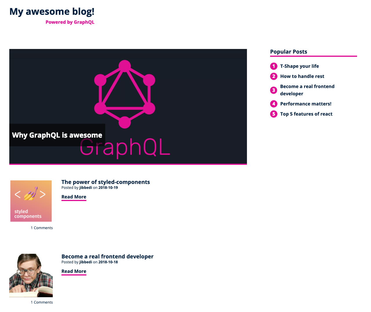
Let's assume we are working on our blog, with a basic two column layout.

The query for the sidebar looks like this:
query BlogHomePage {
...
popularPosts: posts(sortingKey: views, limit: 5) {
    title
  }
}
...
We query the posts, sort them by view count and limit them to 5. Simple enough.
For smaller devices, there is no space for a sidebar so we decide, that we don't want to display the popular posts in that case. So why bother downloading them?
We need to do two things here:
- Check if our sidebar is visible
- Tell GraphQL to only fetch the data if we need it
Using Match Media to check screen width
There's a neat browser API that lets us check if the device is matching our media query. Let's assume we hide our sidebar at a window width of 980px.
// will return true of window is wider or equal to 980px
window.matchMedia("min-width(980px)").matches;
We could have used window.innerWidth >= 980 here as well, but matchMedia will allow us to use the exact same query,
that we use in our CSS and I think that's really cool. Plus we get to query for things like print mode, screen orientation,
and other stuff, that might affect our data needs.
Loading only what's needed
GraphQL has the concept of directives.
One of those directives is @include(if: Boolean), which let us annotate all the fields in our query
we only want to load if a certain condition is met.
Our query now looks like this:
query BlogHomePage($includeSidebar: Boolean) {
...
    popularPosts: posts(sortingKey: views, limit: 5) @include(if: $includeSidebar) {
        title
    }
...
}
Now whenever we run our query, we simply pass in the result from our matchMedia
and GraphQL takes care of the rest.
How neat is that? A simple declarative way to download only the data you need.
The query will come back as null for the fields that are not included in the result, so be sure to check for their presence in your client code. 😉
Adjusting to different connections
So we can choose to remove data we don't need from our response. But we can also specify the type of data we want.
Have you noticed the spotlight blog post at the top? Let's say this was a featured video.
For devices on 4g or wifi that's usually fine to download,
but we probably don't want our users on slower connections to download a huge file - but serve a static image as fallback instead.
Addy Osmani from the Google Chrome Team as a nice post about adaptive serving.
Choosing data with enums
GraphQL supports enums, which are a perfect fit for choosing different output formats.
Our schema looks like this:
enum MediaType {
    image
    video
}

type Post {
    ...
    mediaUrl(mediaType: MediaType!): String!
    ...
}
We can query a post's mediaUrl and pass in whether we want an image or a video URL.
Determine the device connection
Now we only need to access the connection speed using the Network Information API.
While the API is not available in all browsers, we can still use it today. We can simply check for its presence. If it's there, we can fine-tune our data loading. If it's not, we can gracefully degrade to assuming the network conditions are always good and load all the data.
function isDeviceConnectionFast() {
  const connection = navigator.connection;

  // if no connection info available, assume it's fast enough
  if (!connection) {
    return true;
  }

  return connection.effectiveType === "4g" || connection.effectiveType === "3g";
}
Adjusting the query
Now we can adjust our GraphQL query and request the mediaType based on the connection speed.
query BlogHomePage(...,$mediaType : MediaType!) {
...
spotlight : posts(onlySpotlight: true, limit: 1){
    ...
    mediaUrl(mediaType : $mediaType) //either video or image
    ...
  }
...
}
...
Conclusion
Even a single application can have varying data needs, depending on the device's connection speed and screen size. We should strive to load optimized data for each scenario to respect the user's time and data plans.GraphQL can help us with that because it provides an easy, declarative way to specify which data is needed. We don't have to spend time creating optimized endpoints or orchestrating different requests in our code.